

ux research
product design
ux/ui design
Polaris is an internal-facing data and user management tool. In 2019, the Client Manager tool was launched to help consultants manage user accounts and configure access to tools, pages, and datasets tailored to each client team. In 2024, I was asked to redesign the Client Manager tool to improve the consultant experience using the app.
The project goals were to: streamline the workflow for creating and updating client access, reduce manual effort and errors in permission management, and incorporate new functionality that allowed consultants to track client subscriptions and associate them with users.
ORIGINAL DESIGN
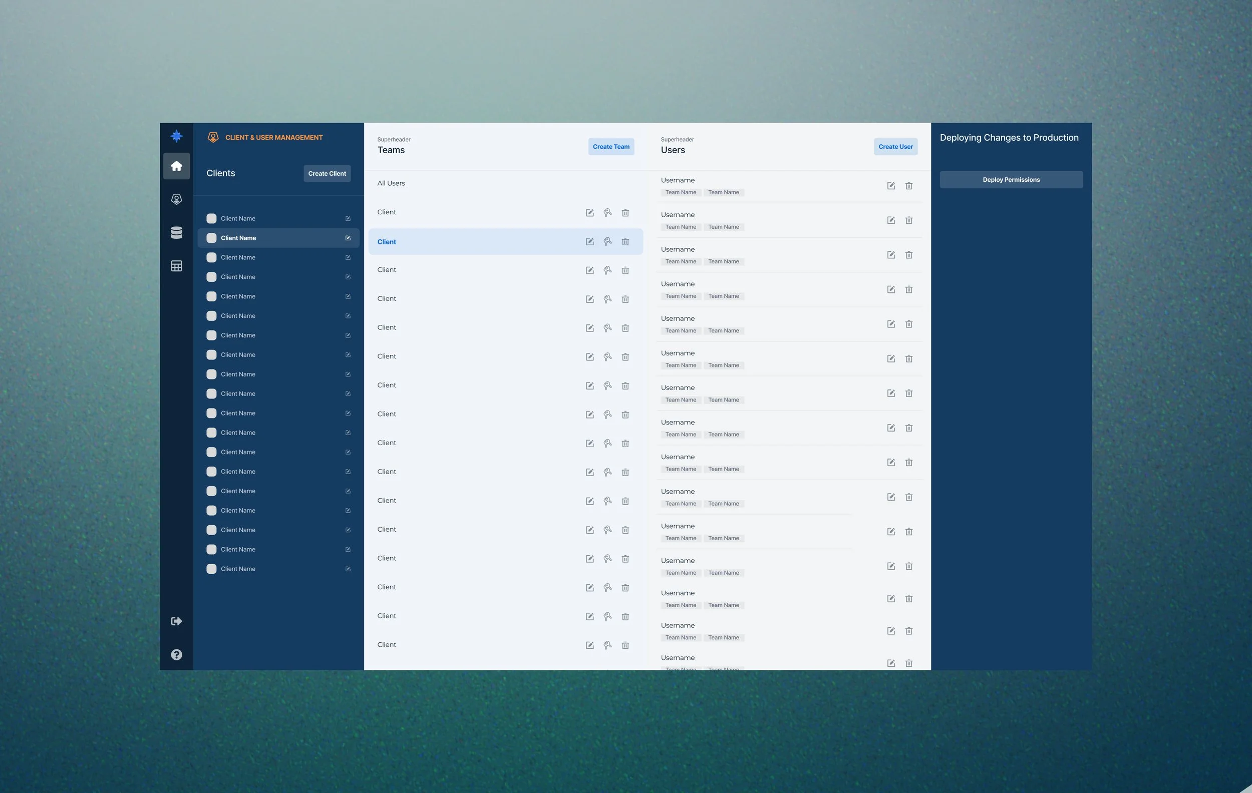
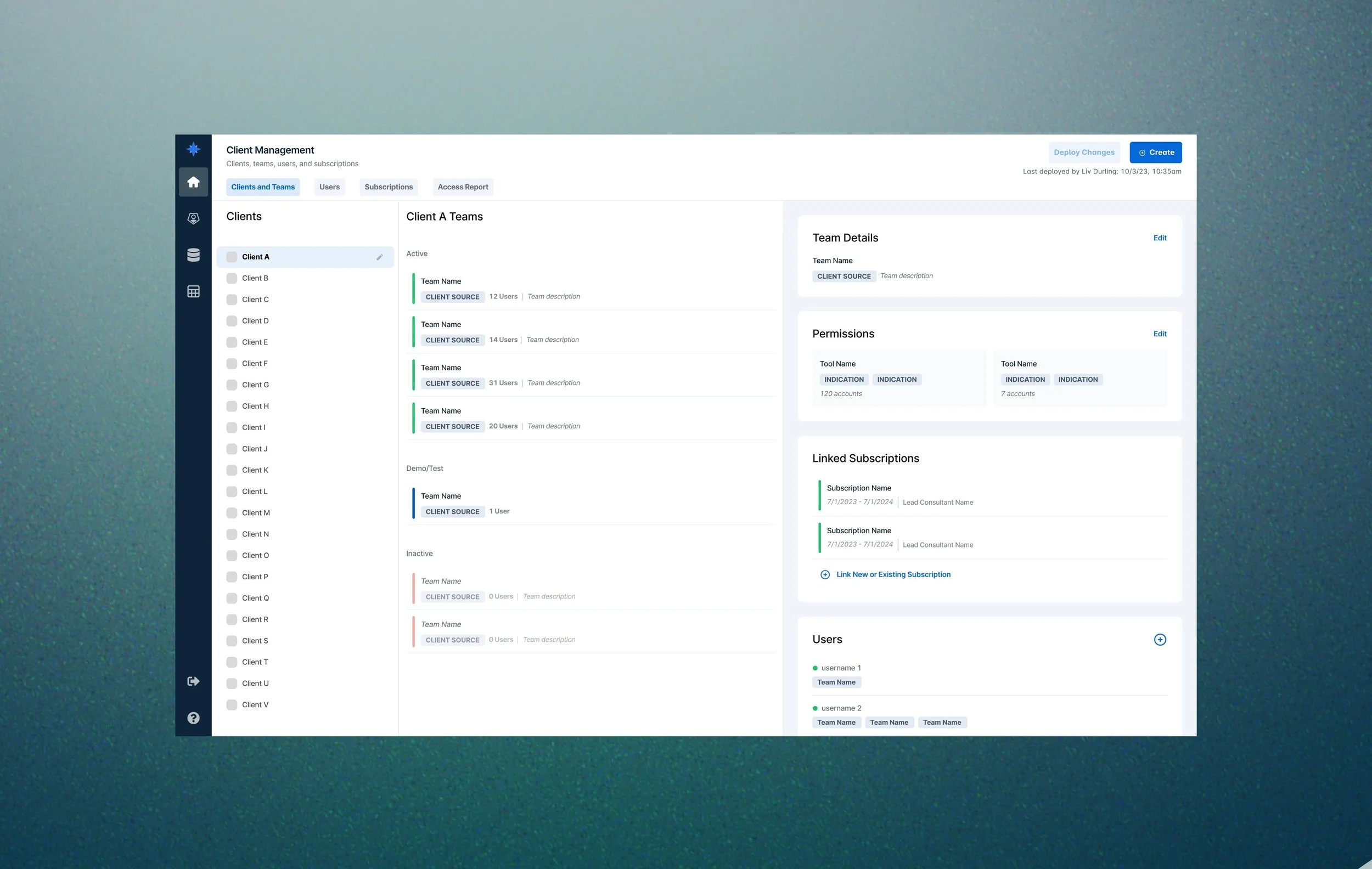
FINAL REDESIGN (MY WORK)
process
1. USER RESEARCH
To kick off the project, I conducted user research to better understand how users were using the Client Manager tool and how the experience could be improved.
I designed and distributed a user survey to gather qualitative insights on:
Typical usage patterns
Core motivations for using the tool
Pain points with the current experience
Desired features or missing functionality
The feedback revealed several opportunities for improvement:
Modernized UI: The existing experience relied heavily on modals, which interrupted workflows and caused full page reloads when switching between them, resulting in a frustrating, "jumpy" experience.
Clarity: Consultants needed an at-a-glance understanding of each client, team, and subscription’s status, purpose, and associated data permissions.
Reporting: Users requested built-in reporting capabilities to help them view and query data without needing to request engineering support.
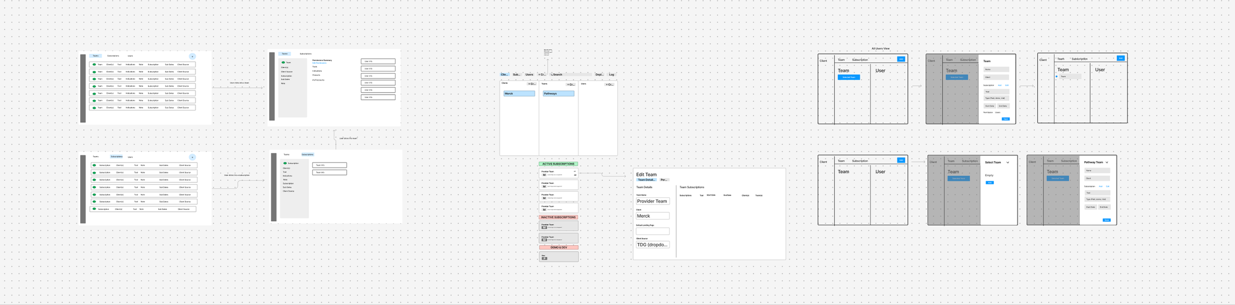
2. WIREFRAMES
To explore layout possibilities and evaluate different design directions, my colleague and I began by creating low-fidelity wireframes. Each of us then selected a wireframe concept to develop further. We translated our chosen layouts into interactive prototypes, allowing us to simulate key workflows and gather actionable user feedback.
3. USER TESTING
I developed a user testing protocol designed to evaluate the usability and clarity of both prototypes. We conducted remote, moderated testing sessions with 8 users who regularly use the Client Manager tool, where users ranked the ease of completing their typical tasks and preference for each option.
Users preferred the prototype I designed, citing the following reasons:
Clean, modern interface with more intentional use of color and iconography, resulting in a less distracting experience
Team-level summaries that provide high-level context before entering edit mode, allowing users to assess relevance at a glance
Smooth editing experience through the use of collapsible side panels rather than modals
Clear active/inactive states, which helped users focus on teams that required their attention
4. SPEC DOCUMENTATION
I incorporated the additional feedback and annotated key interactions for engineering implementation.

final implementation
The preferred design was implemented. In follow-up interviews, users shared that the new interface was significantly easier to navigate and had meaningfully improved their day-to-day workflow.
Users reported that:
The updated layout made it easier to find and edit client permissions
High-level summaries helped them quickly assess each team’s setup
The overall experience felt more intuitive, responsive, and aligned with their needs
The redesign successfully addressed core pain points while introducing new functionality that enhanced the tool’s value.